How to Make a Meme from Your Own Picture: Text, Outline and Readability
Make a meme from your own picture: place the text, set the font, outline and size so it reads on a phone, and see what the meme maker does not do.
Written by the Pixoate team. We check how each tool behaves before we describe it, and we date any prices or portal rules we quote.
A meme is a picture plus a line of text, and most of the ones that fall flat fall flat on the text: too small, too long, or lost against a busy background. The picture matters less than people think. Words that read at a glance matter more.
This guide shows how to make a meme from your own picture, how to size and outline the text so it reads on a phone, and where this tool stops, so you know before you start.
How to make a meme from your own picture
- Pick the picture first. There is no template library, so bring one of your own photos, a screenshot or a sketch that you are entitled to use.
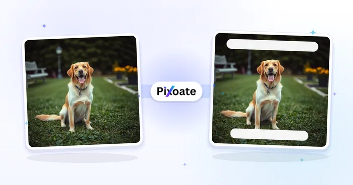
- Open the meme generator and upload it. Two starter boxes sit on the picture, TOP TEXT and BOTTOM TEXT.
- Select a box and write the caption in its Text field. You can also double-click a box on the picture, or double-tap on a phone, to edit it where it sits.
- Drag each box into position and use a corner handle to change its size.
- Select Make my meme, check the result, then use Download.
On a touch screen the same actions work with your finger: a tap selects a box, a double-tap opens it for typing and a drag moves it. The page runs in a mobile browser, so no app is needed.
Choose a picture that leaves room for words
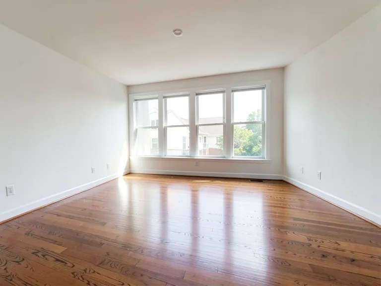
Text needs calm space. Sky, a wall, a floor or a plain edge gives a caption somewhere to sit, while a face or a crowd under the words makes them hard to read. Before you upload, look for a band at the top or bottom where nothing important is happening.
Use the largest, sharpest copy you have. A screenshot that has been through several chat apps is already soft, and text on top of a soft picture looks soft too.
If the joke needs two pictures side by side, build that first. The editor captions one image per run, so join the two pictures in a collage, download the combined image and upload that.
Set the text so it reads at a glance
Short beats clever. Aim for one line per box and two at most. If a caption wraps onto a third line, cut words instead of shrinking the type.
- Font. Anton, the default, is a thick display face that suits captions. Bangers and Bebas Neue are display styles too, and Oswald is a tighter sans-serif. You will not find Impact in the menu. Bold and Italic switch on beside the Font menu.
- Case. The tool keeps exactly what you type, so enter capitals for the classic shouted look.
- Size. The Font Size slider covers 12 to 120. Text scales with the picture when it is saved, so judge the size by eye in the preview, not by the number.
- Wrapping. Lines break at the width of the box. If a word splits awkwardly, widen the box before you lower the size.
Use outline and background so the text survives any picture
The default is a white fill with a black outline, which holds up on most photos. Three controls help when the picture fights back.
- Outline Width and Stroke Color. Outline Width goes from 0 (none) to 10. Raise it over a bright or busy area; over dark, plain ground a thin outline or none looks cleaner. Stroke Color sets the outline color, so a light outline can rescue dark letters.
- Text Color. Light letters on dark areas and dark letters on light areas, with the outline doing the rest.
- Background Color. Uncheck Transparent and the box gets a solid strip behind the lettering, black to begin with. Choose another color from the swatch. A strip gives the most dependable contrast of the three, and stretching it across the picture gives the black box caption look.
Test it the way people will see it: step back from the screen, or view the preview at thumbnail size. If you cannot read the caption there, enlarge it, thicken the outline or add the strip.
Place the words and add more boxes
Add Text drops another box onto the picture. Use one for a label, a reaction or a second line; each box carries its own font, size, colors, outline and background, so a small label and a loud punchline can look different. Remove a box with the bin icon in the Text Boxes list.
Keep words off faces and away from the edges. Leave a margin so nothing touches the border, because a caption jammed against the edge looks cropped even when it is not.
For a plain caption without the meme styling, use Add Text to Image, which opens with one box for you to style.
What this meme maker does not do
- No templates. There is no library of meme formats and no way to browse for them. You bring the picture.
- One picture per run. For two pictures, join them first, as above.
- Still images only. Upload a GIF and you get a single still frame back, text included. For movement, GIF Maker builds an animated GIF from a sequence of pictures or a brief clip, but this tool will not caption an animation.
- No caption writing. You write every word; nothing is produced from the image itself.
- No chat bubbles. For a message-style meme, upload your own screenshot and caption it.
- Flat output. The text is drawn onto the picture and saved with it, so it is not a separate layer. Keep your original file.
An invented example, start to finish
Here is an invented example. Leo has a photo of his dog sitting beside an empty bowl, with a plain kitchen wall above the dog. He uploads it and moves the top box into the wall space with the line "IT HAS BEEN FOUR MINUTES". The bottom box gets "I AM FADING". The words are long for the width, so he widens each box before touching the size slider, and one line fits in each.
In the preview he steps back and views it small. The top line sits on pale wall in white letters with a thin outline, and it is hard to read, so he raises Outline Width and sets a darker stroke. The bottom line is over the dark floor and reads fine. He saves it, checks the file in a chat at thumbnail size, and notices the caption touches the edge on one side. He nudges the box inward and saves again from the original, not from the first meme.
When it goes wrong
- Caption unreadable on a bright area: raise Outline Width, change Stroke Color, or add a background strip.
- Text overflows or wraps into a third line: shorten the words first, then widen the box.
- A word splits in the middle: widen the box rather than shrinking the type.
- The picture looks soft: the source was small or compressed, and no setting repairs that. Find a sharper copy.
- A GIF came back as a still: the tool captions one frame only.
A meme is quick to make and easy to get slightly wrong, so a short review pays off. If you are posting a meme about a person, ask yourself whether they would be comfortable seeing it. When in doubt, use your own pictures or ones you have permission to use.
Check the meme before you post
- View it at the size it will appear in a feed or chat. Read the caption aloud and check spelling and line breaks.
- Make sure no text touches an edge or covers a face.
- Note the file type. It matches the file you uploaded, so a JPEG upload gives a JPEG back and a PNG upload gives a PNG.
- Remember that a free download is web-size, which suits chats and feeds. Premium keeps the original resolution if you plan to print, and Batch (ZIP) repeats the same text boxes across many pictures.
Use images you are allowed to share, and think about whether the people in them would be happy to see the result.
Frequently asked questions
Do I need a meme template to make a meme?
No. Any picture can be the base: upload it, type over the two starter boxes and add extra ones whenever the joke calls for more. The tool has no template library, so you choose the picture yourself.
Can I make a meme from a GIF or a video?
Not with this tool. A GIF returns as one still frame, and video is not accepted for captioning. Caption a single frame here, or use GIF Maker to build an animated GIF from a sequence of pictures or a brief clip.
How do I make the text readable on a busy picture?
Raise Outline Width, set Stroke Color to contrast with the letters, or uncheck Transparent to put a solid strip behind the words. Then check the preview at thumbnail size. A strip is the safest choice when the background is full of detail.
Which font gives the classic meme look?
Anton, the default, gives thick capital letters in the familiar style. Bangers and Bebas Neue are other display options. Type in capitals, keep the fill white and the outline black, and let the outline separate the letters from the picture.
Choose one picture with a clear gap for words, write a single short line and make your meme.