
How to Turn a Color Photo into Black and White (and Keep the Detail)
Turn a color photo black and white without it going flat: which photos work, what the Intensity slider does and what to check in faces, skies and shadows.
Written by the Pixoate team. We check how each tool behaves before we describe it, and we date any prices or portal rules we quote.
You take the color out of a photo and what is left looks gray, flat and a little tired. That is the usual outcome of a plain color removal, and it rarely means the photo was a poor choice. Black and white works when the picture still has enough light, dark and shape to hold together without color.
This guide shows how to turn a photo black and white online with the Intensity slider, how to pick photos that survive the conversion, and what to check before you keep the file.
How to turn a color photo black and white
- Open the converter and upload a color photo. JPG, PNG and WebP files work, along with most other common image types.
- The preview turns monochrome immediately. Drag the Intensity slider, which starts at 70 and spans Subtle at the low end to Strong at the top.
- Stop where the eyes, the weave of clothing and the clouds still read clearly.
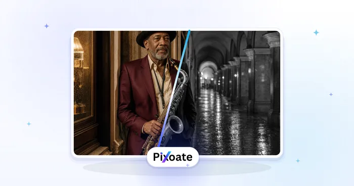
- Select See result. The converted photo opens next to your original with a comparison slider.
- Select Download to save the JPG, or Edit again to change the Intensity and create it again.
This works in a phone browser too, and no app is needed. One caveat: the preview is a quick approximation. The saved file is produced when you select See result and can carry slightly more contrast at middle settings, so judge it with the comparison slider, not the preview alone.
Why removing the color often looks flat
Color does a lot of the work of separating things. A red jacket against a green hedge, an orange sunset over a teal sea, a blue bowl on a brown table: each pair is easy to tell apart in color and surprisingly close in brightness. Remove the color and both halves become similar grays, so the edge between them fades.
What remains is tone: how light or dark each area is, and how much contrast sits between neighbors. A photo that relied on color contrast has little tone contrast to fall back on. A photo with hard window light, a bright sky over dark rock or a clear shadow keeps its structure.
That is why the converter does more than strip color. As Intensity rises it also lifts contrast, which separates the grays more than a straight desaturate would. It cannot repair a photo that was flat to begin with, and an underexposed picture stays underexposed.
Which photos suit black and white
These tend to convert well:
- Directional light, such as a portrait beside a window or a street at low sun.
- Texture: weathered wood, stone, fabric, hands, hair or water.
- Clear shapes, such as a bridge, a staircase or a lone tree against the sky.
- Skies with clouds, where light and dark areas carry the picture.
These tend to disappoint:
- Pictures held together by color alone, such as a red flower among leaves of the same brightness.
- Flat, overcast light with no real shadows.
- Strong color casts, such as warm indoor bulbs, which can turn into a muddy middle gray.
- Very dark or washed-out originals, where the tones are already squeezed together.
Start from the original file when you can. A screenshot, or a copy passed through several chat apps, carries compression blocks that are easier to notice once color stops distracting the eye.
A ten-second test saves a round trip: push Intensity to Strong and look at the preview. If the subject still separates from the background, the conversion has something to work with. Nothing is created until you select See result.
What the Intensity slider really does
Below the top of the scale the slider does not remove color; it blends. At each setting the converter mixes a gray version of the photo with your original. At 40 you get a drained, muted picture. At the top, no color is left and the contrast lift is at its strongest.
One control gives two looks:
- Low to middle settings feel soft and slightly vintage, with color still visible but faded. They can be kinder to skin and to photos that look harsh at full strength.
- High settings give the classic look, with firmer blacks and brighter whites. They suit architecture, graphic shapes and dramatic skies.
Move in steps of ten or so from the default and watch faces first. The converter offers one overall blend and nothing else, so for lighter shadows or a custom tone curve, finish the picture in the Photo Editor.
Keeping one color is not available here
Anyone who asks for a black and white photo with one color left in it usually means a red coat or a yellow door on a gray scene. The converter cannot do that. It applies one blend across the entire photo, and below the top setting it leaves a hint of every color, not one chosen color.
The honest route is Color mix (HSL) in the Photo Editor:
- Choose Edit a photo, upload the picture and select it on the canvas.
- Open Adjust and scroll to Color mix (HSL).
- Pick a color channel (Red, Orange, Yellow, Green, Aqua, Blue, Purple or Magenta) and drag its Saturation to -100.
- Repeat for every channel except the color you want to preserve.
- Zoom in, check the edges, then download.
Color mix works in overlapping bands, not hard masks. Colors that sit between two bands can keep a faint tint, and neighbors of the color you preserve can lose a little of it. If it looks washed out, raise that channel's own Saturation slightly. Do not switch on the B&W look or the Grayscale switch for this job; both strip all color first, so nothing is left to preserve.
Check faces, skies and shadows before you keep it
Use the comparison slider on the result card and inspect three places at full size.
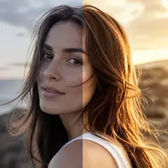
- Faces. Skin that looked healthy in color can turn chalky or heavy. Check the eyes, the edge of the lips and any shadow under the eyes. If the face has lost its shape, lower the Intensity.
- Skies. A blue sky with clouds usually separates well. A pale sky can lose its clouds, and a smooth gradient can look dull, so compare the horizon with the original.
- Shadows and highlights. At high settings dark areas can close up and bright areas can burn out. Look for detail in hair, dark clothing and white fabric.
Also read any sign in the frame and glance at the corners. If something looks wrong, select Edit again, change the Intensity and create it again. Each change clears the old result, so nothing stale gets saved.
What you download and where to go next
The download is a JPG, which has no transparency, so a PNG with see-through areas loses them. Without Premium the file you save is a web-size copy; Premium returns it at its original resolution for large prints. Batch, a Premium feature, applies one Intensity to a whole set and returns a ZIP, so tune the value on one representative photo first.
If the picture needs more than a gray conversion:
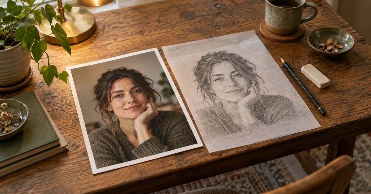
- To draw it rather than convert it, make a pencil sketch from the photo, which shades from the photo's light and dark values.
- To work on light, contrast and curves, or to preserve a single color, use the Photo Editor with Color mix.
- To go the other way with an old monochrome print, colorize the photo. The colors it adds are estimates, not a record of the original scene.
Here is an invented example
Picture a portrait taken by a window in late afternoon, with warm skin, a green wall and a navy jacket. In color it looks pleasant, but in gray the wall and jacket may land at nearly the same brightness. Try the default Intensity first, then compare the jacket edge against the wall at full size. If they merge, raise Intensity a little, since that lifts contrast. If the skin turns chalky, lower it again. You are balancing two opposite risks, and the right setting is the one where the face keeps its shape and the edges stay readable.
Related guides
To turn a photo into a drawing instead of a gray version, see turning a photo into a line drawing. For faded family prints, restoring an old photo covers repair and color.
Frequently asked questions
Is turning a photo black and white the same as desaturating it?
Not quite. Desaturating removes color and leaves brightness as it is. This converter blends gray with your original below the top setting and lifts contrast as Intensity goes up, so the high end is punchier than a plain desaturate. Neither fixes a flat or underexposed original.
Can I leave one color in and turn everything else gray?
Not in the converter, which applies one blend to the whole picture. Use Color mix (HSL) in the Photo Editor: lower Saturation on every channel except the one you want, then check the edges at full size.
Why does my black and white photo still look dull?
Usually the original has little tone contrast: overcast light, a difference that lived only in color, or a muddy exposure. Try a higher Intensity, choose a photo with real light and shadow, or lift contrast and the tone curve in the Photo Editor. Converting changes color, not exposure.
Pick one photo with real light and shadow, turn it black and white and check faces, skies and shadows before you keep it.