Why Shopify Product Thumbnails Look Uneven and How to Fix Them
Fix uneven Shopify product thumbnails with Pixoate. Align canvas sizes, product placement and surrounding space for easier catalogue comparisons.
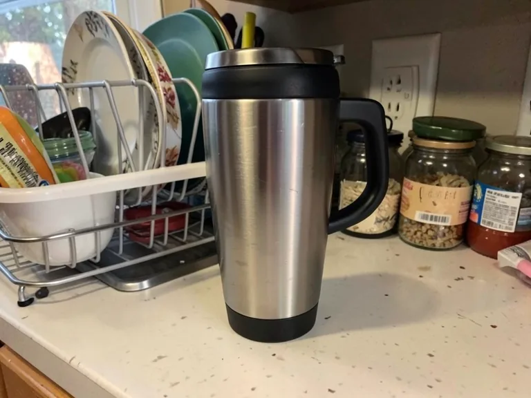
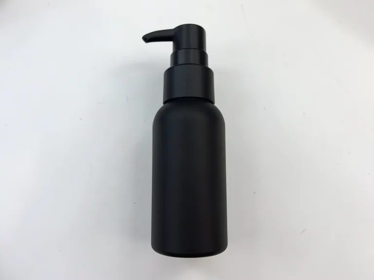
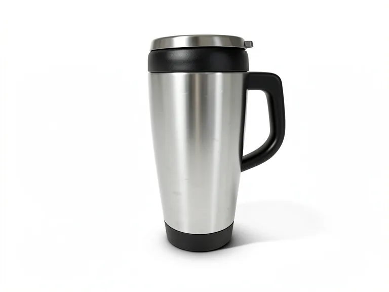
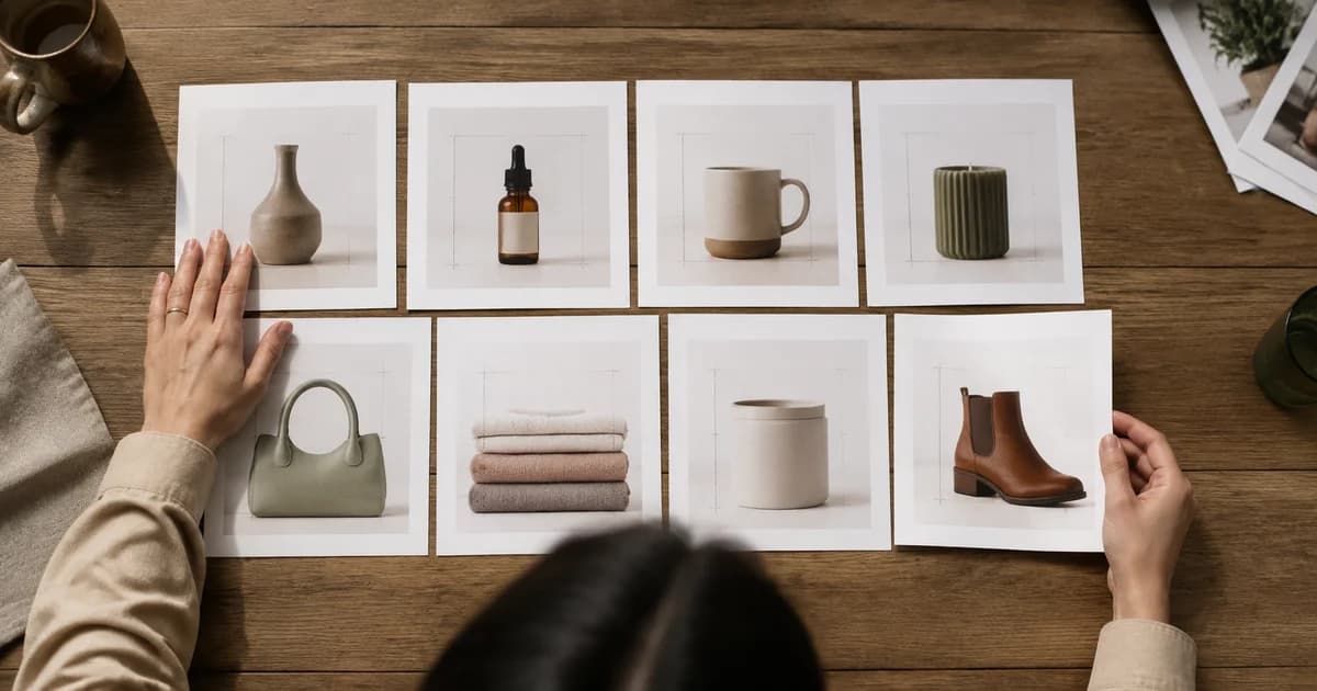
One mug fills its product card while the next looks tiny. A tall bottle touches the top edge, a bowl floats low in the frame and the backgrounds alternate between cream, grey and white. The collection grid feels uneven even though every file has the same pixel dimensions.
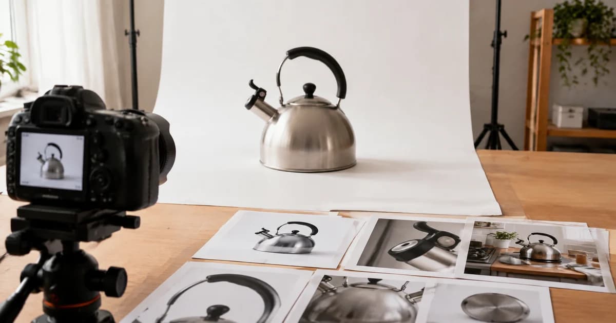
Consistent thumbnails depend on the product's position inside the image as well as the image's outer size. Pixoate's background remover with product-layout controls can help standardise that inner composition.
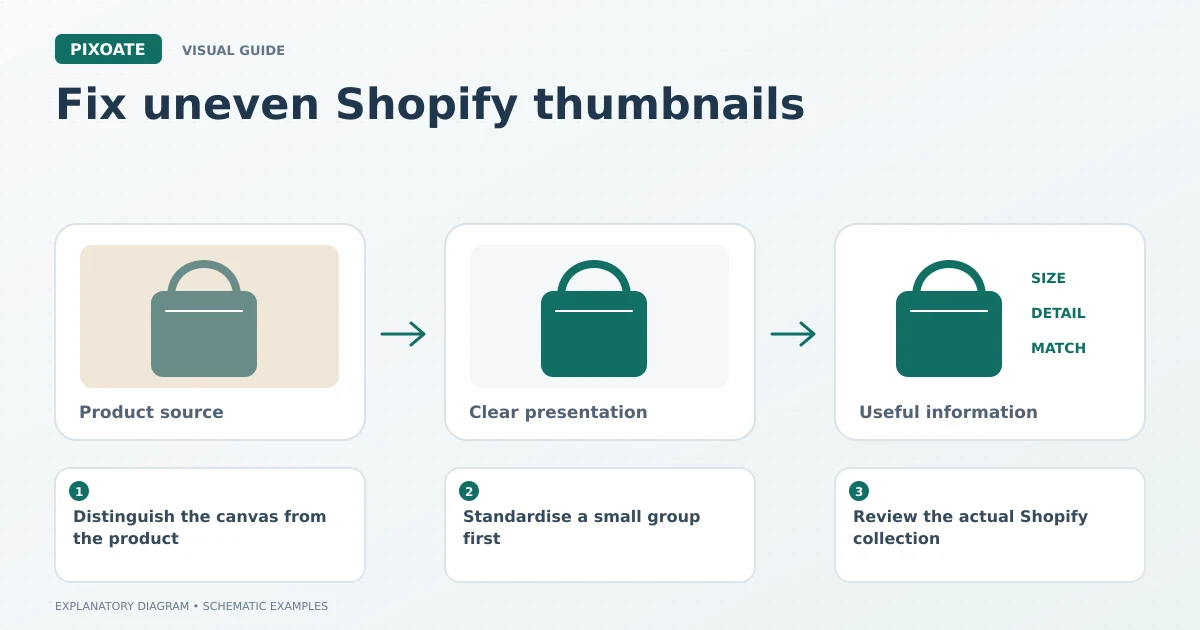
Original explanatory graphic. The scenes and sample records are schematic illustrations, not screenshots or measured tool results.
Distinguish the canvas from the product
Two square images can contain very different amounts of empty space. Resizing both to the same width does not automatically make the products comparable in visual scale.
Decide on a useful framing convention for each product family. Bottles may share a baseline and top margin; plates may share a similar diameter in the frame. Different physical products need not look equally large if that would create a misleading impression of scale.
Standardise a small group first
Open Pixoate Remove Background and review the cutout of a representative product. Choose the background and, in the applicable batch workflow, use product-layout settings for trimming, centring, padding and square output.
Include an awkward sample before processing the whole group: a handle, a thin strap or a reflective edge often exposes a setting that needs adjustment. Batch access depends on your account and the tool's current options.
For images that already have suitable framing, resize them to consistent dimensions. Use Photo Editor when an individual composition needs manual positioning or extra canvas space.
Resize a product photo set with consistent margins
Use a small approval sheet before exporting the catalogue. For an illustrative 2000 × 2000 canvas, a centred object with a 1600-pixel longest dimension leaves 200 pixels at each end of that axis: (2000 − 1600) ÷ 2. Its shorter axis has more empty space. This is a composition example, not a Shopify requirement or a claim that resizing automatically detects the product.
| Product family | Shared decision | Exception to inspect |
|---|---|---|
| Similar bottles | Baseline and top clearance | Pump or spray head extending above the body |
| Mugs | Body scale and space around the handle | Handle protruding into the safe margin |
| Plates | Centre and visible rim | A matching set containing different real diameters |
Use layout or canvas controls to position the subject, then resize the completed canvas. Applying the same pixel dimensions to three differently framed originals preserves three different compositions. Avoid stretching a narrow bottle simply to make its width match a jar.
Keep the lead image for each comparable product beside the others at thumbnail size. Then open a full-size view to confirm that padding has not hidden useful detail. The Shopify sizing workflow covers this handoff from composition to export.
Review the actual Shopify collection
Upload a small reviewed set and inspect the collection page. The theme may crop or fit images differently from your local preview. Check desktop and mobile before replacing the rest of the catalogue.
Look at the grid as a whole, then open each product. A consistent collection thumbnail should not come at the cost of cutting off a feature someone needs to inspect on the product page.
| Visible problem | Likely adjustment |
|---|---|
| Product looks tiny inside the square | Reduce unnecessary inner whitespace. |
| Tall items touch the edge | Add a deliberate margin. |
| Products sit at different heights | Use a consistent baseline or centring rule. |
| Theme cuts off the product | Reconsider source framing and the theme's display settings. |
Should every background be pure white?
Choose a presentation that suits the placement and current destination requirements. The useful principle is deliberate consistency within a comparable set, not one universal background for every campaign.
Can I stretch a product to fill its card?
Avoid distortion. Preserve proportions and adjust the surrounding canvas instead.
Start with Pixoate's product background and layout workflow. A few consistent decisions about margins and positioning can make the catalogue easier to scan without changing the product itself.