
One Store, Five Photography Styles: Why Your Shopify Catalogue Feels Inconsistent
An inconsistent Shopify catalogue makes products harder to compare. Use Pixoate to coordinate backgrounds, framing and scale across related listings.
A store can acquire five photography styles without anyone choosing them. The first products came from a supplier, the next batch was photographed by the window and the newest collection arrived with lifestyle images. Together, they make the catalogue feel assembled from several different shops.
The problem is often a series of small visual differences: product scale, margins, baseline, lighting and background. A consistent grid gives those decisions a shared purpose.
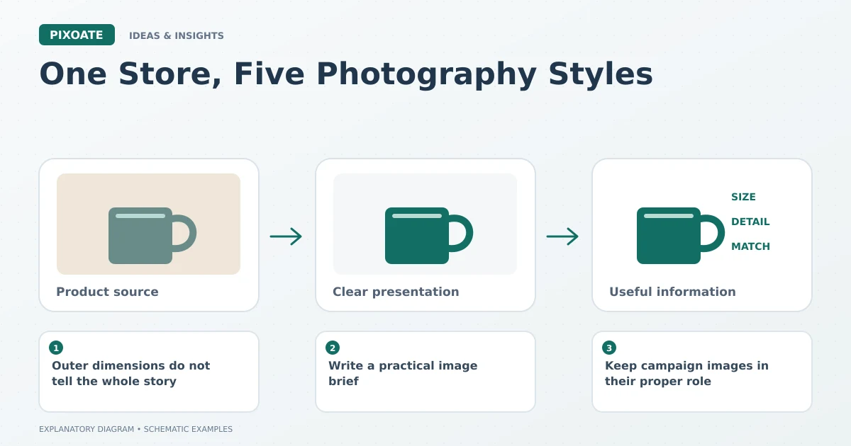
Original explanatory graphic. The scenes and sample records are schematic illustrations, not screenshots or measured tool results.
Outer dimensions do not tell the whole story
Two files can both be square while one product occupies almost the entire frame and another sits in a large field of empty space. Resizing the files to identical dimensions preserves that difference.
Review the inner composition. Decide how comparable products should sit in their frames and what spacing keeps them easy to scan. Preserve real differences in product size where those differences matter to the offer.
Write a practical image brief
Choose a background family, framing convention and output shape for each comparable product group. A brief for jewellery may differ from one for furniture. Consistency is useful when it supports comparison, not when it forces unrelated items into an unsuitable rule.
Use Pixoate Remove Background to prepare cutouts and review the available product-layout controls. Check difficult edges and transparent parts before applying a shared approach to a batch.
Use Resize Image for the final dimensions, keeping proportions intact. A uniform canvas should never require stretching the product.
Keep campaign images in their proper role
A seasonal lifestyle image can add context to a product page without becoming the collection thumbnail for every item. Decide which asset identifies the product and which tells a campaign story.
Keep the correct variant connected to each image. Visual consistency is not an excuse to use one convenient photo for several different colours or configurations.
Review the collection in the actual theme
Upload a small sample and inspect the collection on desktop and mobile. Theme fitting and cropping can change the visual result. Review the group first, then inspect individual product pages for lost detail.
Record the approved settings and a few representative examples for the next catalogue update. That gives a colleague something concrete to follow rather than a vague instruction to “make it look consistent.”
Use Pixoate's background and product-layout workflow to resolve a specific group of mismatched images. A coherent catalogue grows from repeatable decisions about the product inside the frame.